
Last Saturday, Michelle from MY Creative, invited me to one of her Eat n Snap Photography "walkshops". It's a really fun concept - you meet for brunch, talk photography (ISOs, Aperture, Shutterspeeds, getting onto manual, composition and lighting and etc) and then you head out to snap some pics. We met at Market Cafe near the Broadway market for some yummy nosh and then we headed out to take some snaps of the market happenings.
When I was at university, we did a short photography course as part of our design course - of course back then I was "all about the party" and
Side Note: Michelle has a really excellent blog post on Making the Move over to Manual - definitely worth the read if you are still playing around on auto (naughty you) or on priority modes.
Composition:
After discussing a few vitals in terms of setting your camera up based on the light and the type of photo you want to take - we chatted a lot about composition. Composition in photography is very similar to composition in design - I actually love this blogpost Michelle wrote on the composition of Dutch Still Life Paintings - translated into photography and her still life shoot.
1. Rule of Thirds
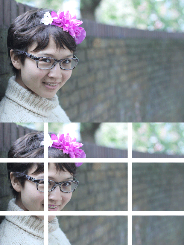
There are loads of different websites and photography blogs that will tell you aaaalllll about the rule of thirds and if you do a quick google image search you will see exactly what it means. The idea is that the composition or the framing of a photograph is much more interesting and appealing to the eyes if the main subject is not slap-bang in the middle of frame. From our many design courses (and from what I can still remember about eye-track theory) if you position your main subject on one of the third grid lines - your eye will immediately go to that "thing" as the strongest point of reference in your frame (in the case below, it is the lovely Xandra from Fashionably light) After that, because it has been positioned on the third line - you eye knows exactly what it must do - it must travel right to explore the rest of the picture. Your brain and your eyes are not in conflict - it is peaceful. Peaceful = harmonious = good picture. If Xandra had been slap bang in the middle of the picture - your eyes would have settled on her straight away - because she is the main subject - but then you would have entered a state of INNER PHOTOGRAPHIC TURMOIL - (I made that up) and your eyes would be thinking "should I go left? should I go right? up? maybe going down?" And then your brain will explode. Make it peaceful for the viewer - use the rule of thirds.
2. Geometric shapes:
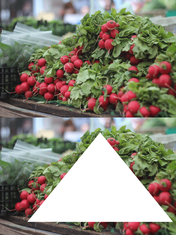
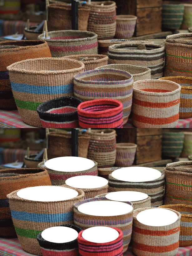
Let me tell you something - humans are lazy. Our eyes want to settle on things that we already know. Things that are easy for us to look at. Like shapes - they are easy to look at - we've been looking at them since we were 3. Our eyes don't have to do much work to settle easily on different shapes - so look for them, naturally occurring in your photos
3. Repetition and Patterning:
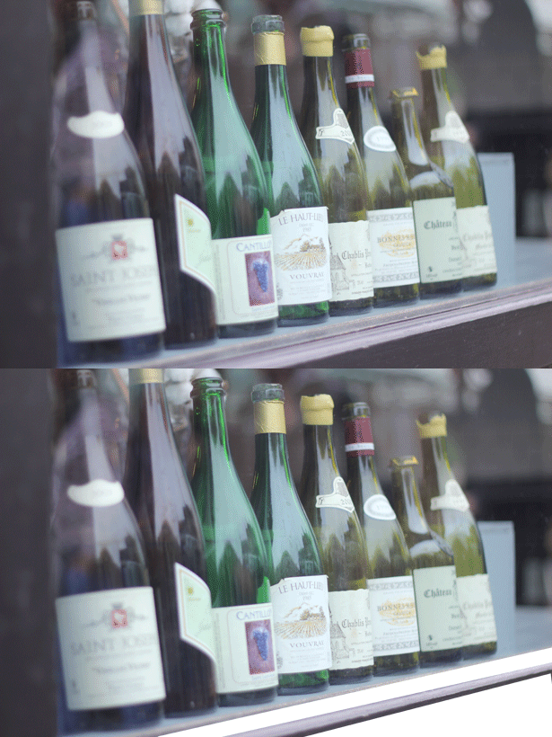
There is also the idea of repetition and patterning - which Michelle went through with us. Similarly focusing on lines and shapes that draw our eyes peacefully through a picture. Basically you want to take a picture where the eyes know exactly what they are supposed to be doing or that they are being "led through the picture" with your composition of different shapes and patterns.

4. Balance and Symmetry
There are also plenty of posts which talk about symmetry and balance and you can see a lot of examples in Michelle's still life snaps - I love the way she uses negative space to balance out the subjects in her pictures.
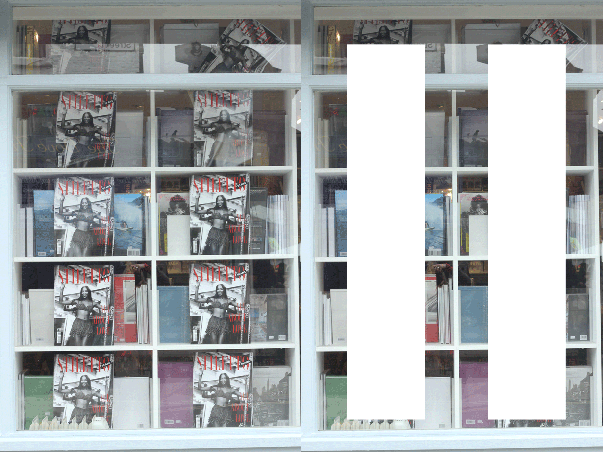
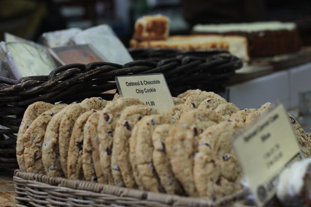
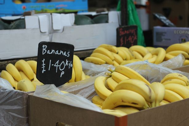
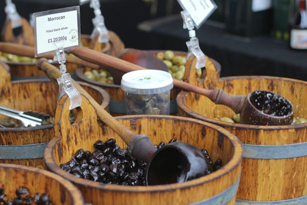
and just a few other snaps from the day -
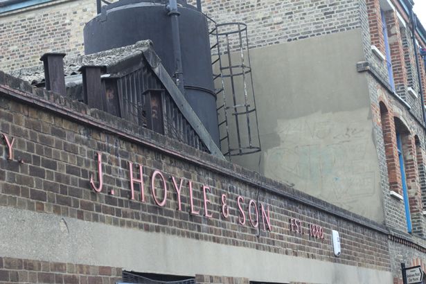
(the husband met me for a drink and a game of backgammon in a local pub after the walkshop - he took this construction/building pic above)
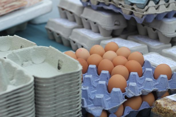
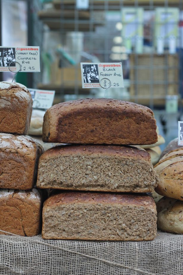
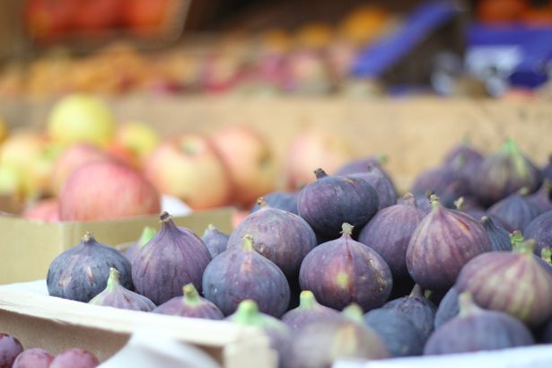
Photography is also very subjective and what is pleasing to one person may not be all that great to the next. Personally, I lean very much towards pictures that are lighter and more over-exposed than what would be considered "good". For example, I took these three fig pictures on different settings and although the two below are very "blown out" - I actually really like them -
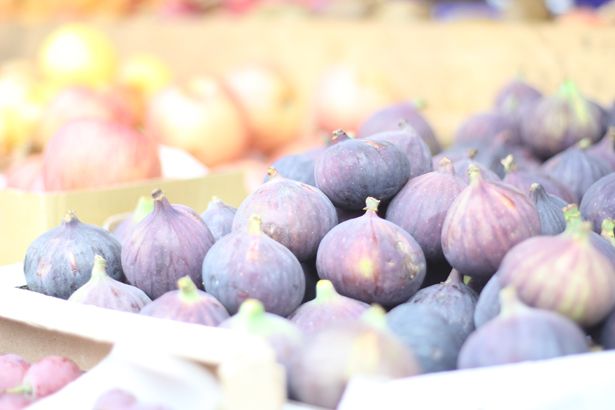
For me, there is some kind of whimsical and intriguing mood that is created - and your eyes have to search around a little to see what is going on - almost a bit of a nostalgia/dreamy kind of quality -
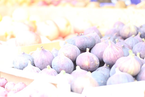
what do you think?
Thank you so much for inviting me on your Eat n Snap workshop Michelle - I had such a lovely day - and I can fully recommend this walkshop to anyone regardless of photography level - I came away from the Walkshop feeling super inspired and making a promise to myself to take my SLR with me more often on my adventures and to snap away... on manual! I loved all your tips and your peaceful and gentle teaching manner.
Michelle is heading over to Italy in the next few weeks - but she is running her next Eat n Snap walkshop from Paris on the 19th of October - book yourself a place - because what is better than croissants, coffee, the Eiffel Tower and photo-snapping? Nothing. And her walkshops come with an awesome hand-out that is the perfect size to slip into your camera bag to remind you of everything you've learned!
And if you have time for a quick something beautiful - check out Michelle's inspired by words series - how gorgeous are these pictures?!
ps: forgot to add - Michelle is also South African - double bonus.

Lovely post, I agree about the overexposed images, I had fun writing a blog post once featuring a lot of photos I took one really frosty day where I played around a lot with the exposure and contrast in Photoshop. The workshop sounds like a lot of fun too!
ReplyDeletethis is great! such a useful post thank you.. And great photos! :)
ReplyDeleteBumble Speaks
I love this idea!! I wish I lived closer to London now, I want to go
ReplyDeleteWhat a clever little Berry you are! ;)
ReplyDeleteEnjoyed this post Che, uber useful x