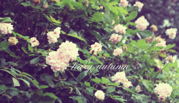
(i have actually decided I don't like this font very much. oh well).
It seems a little strange to be posting this now - since I'm currently back in South Africa and it's very much not Autumn - but I figured that by the time I get back to the UK it will be winter (kill me) and then it will be way too late to post this.
The husband and I went for a walk the other night - just around the block and I ended up snapping a whole bunch of pretty autumn leaves. I have spent a bit of time playing around with them in photoshop. When I first got my SLR (years ago) I used to spend SO much time messing around with photos and photo manipulation in photoshop and this little session made me remember how much I love it.
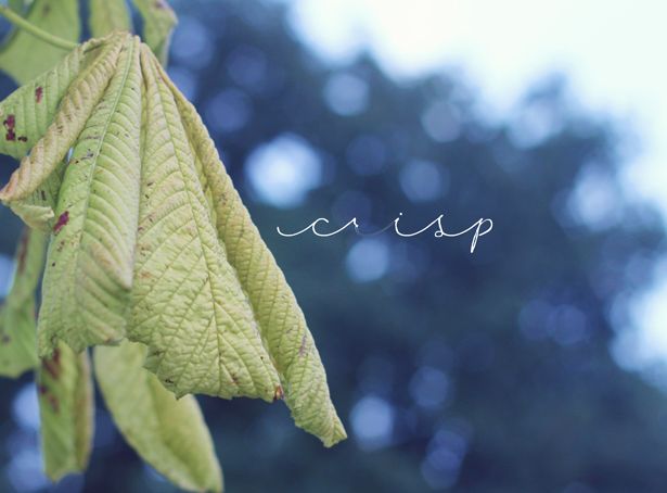
I love this font - (ck carolyn) but I've noticed that at slightly bigger font sizes and between certain letter combinations - it starts to disappear. SOB. Why would you do that font-makers. WHY?
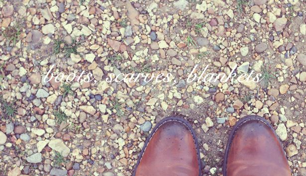
I have been playing around with the idea of creating a "double exposure" film type of look -
hey! hey!?
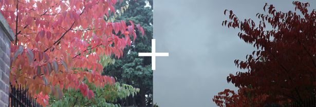
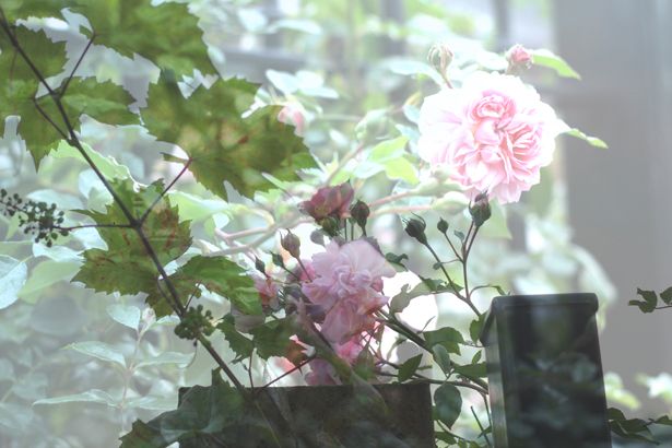
I mixed these two pics above to produce the pic below as a kind of "double exposure". I really like the leaf patterning in the top right corner.
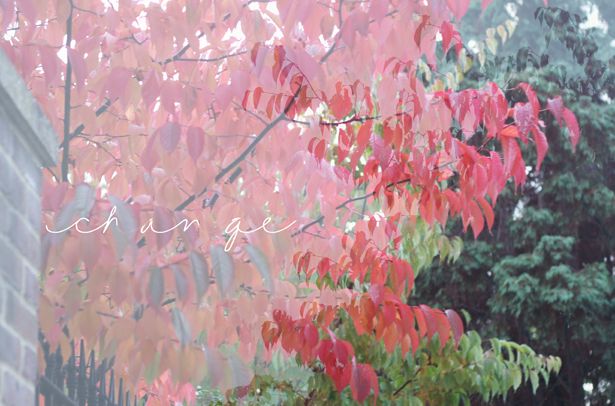
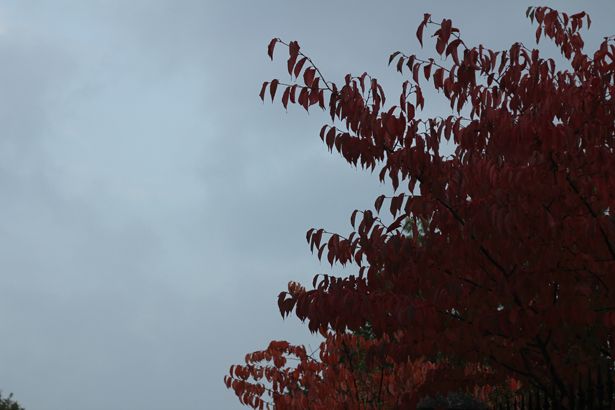
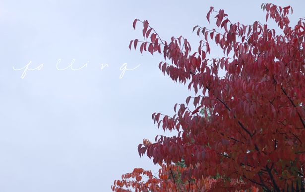
Also goes to show how much you can change a picture in photoshop (above, below).

These are another two pics I mashed together for fun - it's a bit less obvious than the first rose bush ones because these pics are both already quite busy - but I still like it. Gives the idea of running through a rose garden, no?
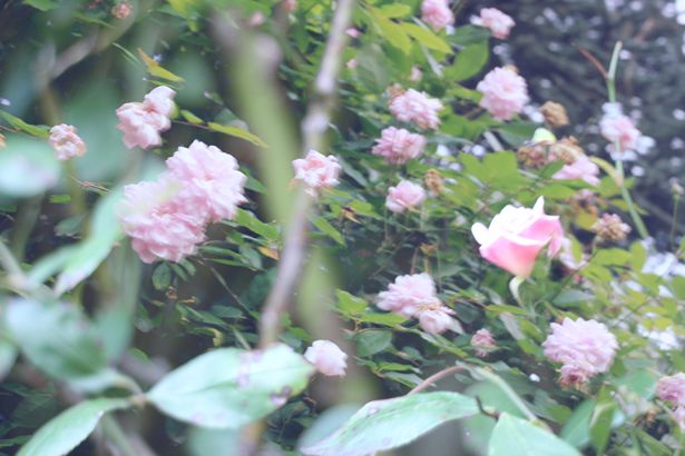
Midway through the editing process, (I had created a fill layer over my photograph) and I was like - "this isn't the end result I'm looking for at all - but... look how pretty it is!"

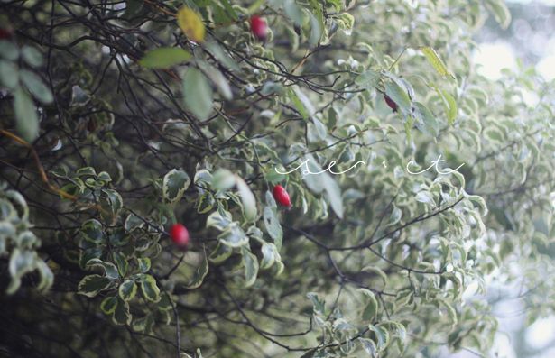
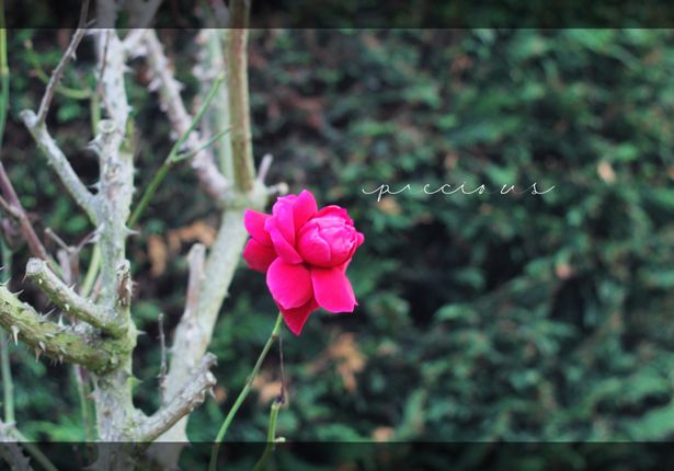
Damn you CK carolyn font.
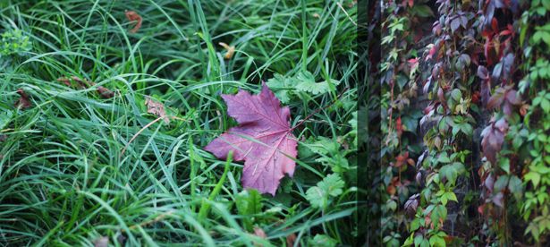
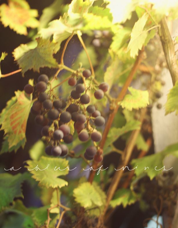
Before everyone emails to tell me - i know this picture is blurry.
But i really like the colours so I couldn't stop myself.

Then, just before it got too chilly, we stopped off and had a delicious glass of red wine on the sidewalk at one of our local village pubs. Even though we were on detox week - "look at all these amazing red leaves! Wow, look at that pub selling amazing red wine! It's a sign."
Perfecto.
x

4 comments :
Such a lovely and very different post I really like it. I'm currently trying to brush up on my photoshop skills so thanks for a couple of handy little tips :) xxx
teacupsandfairywishes.blogspot.co.uk
I love seeing how people manipulate images, especially like the double exposure type ones x
gorgeous!
I suck with photoshop!
But these are pretty!
xxx
Post a Comment