I was recently asked on twitter to share some of my favourite people-to-follow in the realm of creative packaging design. I could look at brand packaging for HOURS, mainly because it's kind of like gift-wrapping for companies - and we all know how much I love a good gift wrap.
There are way too many people that I could recommend you follow - either the designers themselves or the sites that collate their work (often without linking back - grr) So anyway, here is a collection of a few of my faves and you can see which ones you like and hit them up on twitter if you so wish.
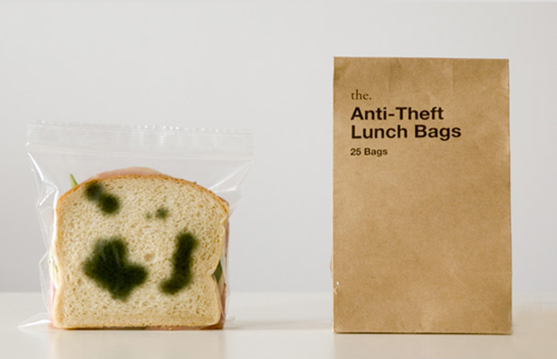
ABOVE: The anti-theft Lunch Bags - created by the. company from two designers Sherwood Forlee and Mihoko Ouchie. Sherwood actually grew up in Zimbabwe (woop Africa!) I love this design - so smart. AND... sneaky.
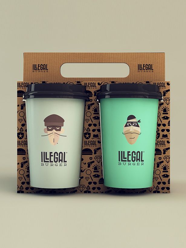
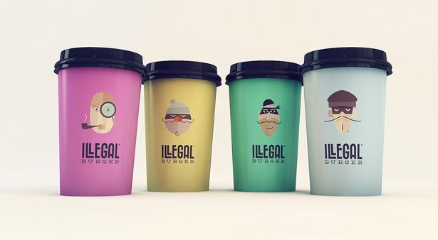
ABOVE & BELOW: This is one of my favourite brand identity collections - partly because it's cartoon all over it and partly because of the amazing hue of colours. Designed by Isabela Rodrigues. In fact, all their brand packaging is pretty awesome - definitely have a look at their website.
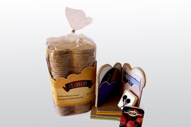
ABOVE & BELOW: This packaging design was created by May Tsui - it's a collection of CDs packaged to look like slices of bread. I'm a complete sucker for "alternative" packaging design.
Once, when I was living in South Korea - I stumbled across a set of notepads and cards that were shaped like a milk carton. I had absolutely no use for the milk carton note-set but I bought it anyway because I. couldn't. help. myself. Asia really does have the greatest packaging of all time.
I need to go back.
(ahem, husband.)
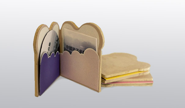
Anthology of Bread, anyone?
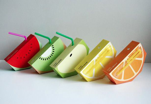
ABOVE: These little "Jooze" cartoons were created by Yungyeen Yong as part of her student design portfolio. They are targeted at kids - but let me tell you, if I came across one of these in the shop, I'd buy it based on the packaging alone.
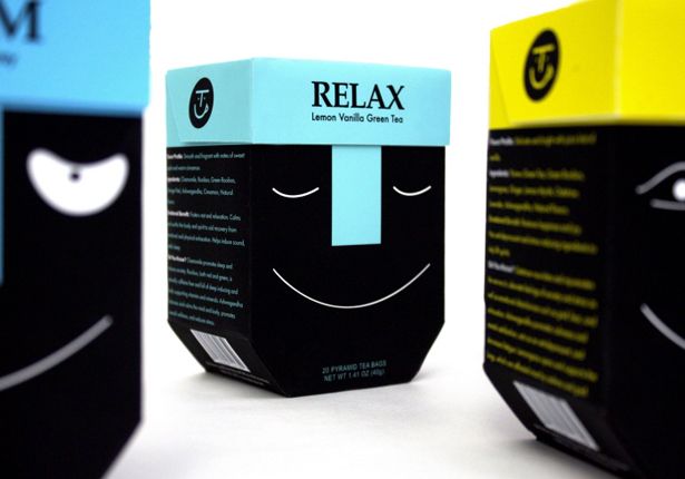
ABOVE: These tea packages were created by Jaeyoung Ha. What did I tell you about Asian Designers? Or maybe those are just the designs I'm most attracted to. Whatever, it's beautiful.
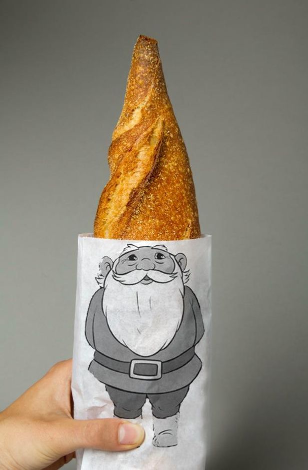
ABOVE: I am a huge fan of packaging that makes use of the product itself. Above is a perfect example of what I'm talking about - designed by Lo Siento. It makes the audience feel part of the design experience - which is of course, always a win. ("HAHA! Look at me! Look what I did! I pulled this bread out and gave this little gnome a hat! Look at me - I'm so clever!") Nope, that'd be the designer - but.... you have your two seconds of glory and go ahead and buy more bread to show your friends.
Design Win.
(Another excellent and completely harrowing example of this is from the Landmine Campaign - I haven't posted it here because it's quite hectic - but you can see it posted on my Creative Packaging Pinterest Board)
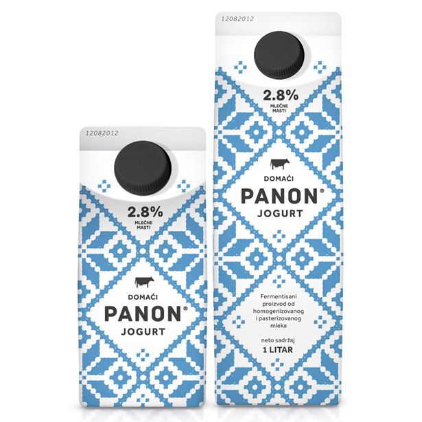
ABOVE: Packaging is always good when it evokes some kind of feeling. For me this embroidery style milk carton design by Peter Gregson does exactly that. When I look at this embroidery pattern sitting so perfectly on this milk carton - I immediately think of some lovely Swiss cows that are grazing in the lovely Swiss Alps in lovely little knitted jerseys. No?
So those are a few of the package designs that I love -
If you want to follow any websites that do a good job of collating these kinds of designs (and since a lot of these personal designers accounts tweet in foreign languages)
I can recommend:
The Dieline - curation of interesting package design
Lovely Package - packaging design from around the world
Behance - a collection of design portfolios
Eight Hour Day - mainly design and illustration with the odd packaging concept thrown in.
You can also follow my Creative Packaging Pinterest board for some visual inspiration.
Happy Monday everyone
x

1 comment :
I don't know if I will eat my own bread if I see it in that packaging! haha
xxx
Post a Comment